Idependence Charter Academy
Wireframe
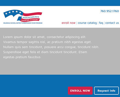
The client wanted a new website to help drive enrollment at the academy. The goal was to clean up the user experience of the website and direct attention to the call to action. We wanted to keep the design simple, bright, and on brand with our client.
Click image for full site view
The client really wanted to keep their website clean,
simple, and bright. Their main focus of this website would be to drive enrollment at their academy. Outside of that main call-to-action, there were 4 benefits of the academy they wanted highlight and we would also need to include the mission statement, values, and vision statement
of the academy.
Click image for full site view
The main thinking behind this design was to use a simple, bright color palette pulled from the company logo
and utilize a clean layout that emphasized negative space.
I wanted to minimize the amount of links/buttons on the page to keep visitors from getting lost somewhere away from the CTA. It was also important to highlight the CTA in a separate color so that eyes are drawn to it. Vector images seemed like a great way to highlight the benefits of the Academy without overdoing it. It was important to me to keep the footer simple instead of including a lot
of secondary navigation that the user could get lost in.
This design helps to deliver the necessary information without overwhelming the user. The easily identifiable CTA will help to increase conversion of new users.


